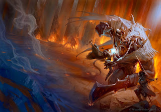
I'm wondering how much of this we're seeing in the 5e covers? Apparently, this is the full picture Tyler Jacobson created for the PHB:
I gotta admit, as an image, I like this (even if it does look like the giant's been cut off at the knees). It's got action and scenery and reveals a lot of imagination. I love the hellhounds chained beside the throne and the dragon wing hanging from the giant's fancy hat.
I still don't like the crop they made for the cover, though. And blowing up the image like that didn't do anyone any favors.
Someone (Stuart Robertson? I can't find who now.) commented about the bad crop jobs done on these covers, how they're too close, cutting out interesting details and reducing important figures to illogical bits. Seeing the full version of the PHB, I can only agree.
I'm still not a fan of the art for the DMG. It's neat, but really doesn't knock my socks off. Apparently, the liche is raising the recently deceased to join it's legions of undead. Neat idea, but I think I'm just not on the same page as the artist when it comes to motivating DMs:
The lich is extremely powerful and we wanted the DMs out there to get excited about wielding that power. From my angle, I wanted the lich to be looming over the viewer and seem unstoppable as he raised the corpses around him. Heroes that just fell in an attempt to destroy him are now working for him. Very demoralizing.


1 comment:
Still not a fan. I don't like seeing flying swordsmen on my straight fantasy covers. It's not supposed to be wuxia.
Post a Comment