There are some folks out there who think I don’t like Mr. Reynolds’ art.
Some assume this because I like to tweak 3.x-philes by pointing out his skill at making
“furry” art.
Others look to my appreciation of Elmore, Otus, and Parkinson, and assume that I must therefore denigrate Reynolds.
A lot of this appears to be based on how deeply the art of Wayne Reynolds has become associated with D&D’s 3.5th edition. For whatever reason, when people think about current D&D, they imagine Mr. Reynolds’ work. And well they should, because Mr. Reynolds is a master at his craft.
But it’s a lot harder to write a critique of Mr. Reynolds’ art than it is for other artists who have put their stamp on D&D. The others have a very firm, easily recognizable, and rarely changing signature style. The work of Erol Otus has its bizarre, fever-dream feel. Larry Elmore is the chief practitioner of the you-are-there school.
But among the many things that make Wayne Reynolds’ work unique is his mutability as an artist. Simply put, Mr. Reynolds adjusts his style conform to the needs of his clients. To show you what I mean, let’s take a look at some warriors he’s painted. This first was for WotC. She’s clearly an exemplar of what has become known as the “dungeon punk” style. Note the insanely spikey armour, that would seem to be as great a threat to the wearer as it would be to her opponents. Also notice the shield and sword, which seem heavy, ornate, and unwieldy. It’s hard to imagine anyone actually trying to fight in that get-up, but it’s certainly eye-catching, and fits perfectly the feel WotC has gone for with their D&D 3.5 products.
Now, let’s take a look at something different. This depicts a historical clash between Asian and eastern European warriors. Notice how much smaller the weapons are, how the armour and shields are clearly functional. Notice also how much more you feel drawn into the picture. The first picture is cool-on-display. This second has a much stronger you-are-there vibe. I believe it was done for Osprey’s series of military history books, so you’d expect them to stress historical accuracy and the ability to put the reader into the action. Again, Mr. Reynolds’ delivers, though the challenge is quite different.
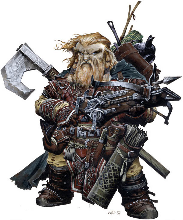
Finally, here’s a dwarven warrior created as one of Paizo’s “iconic characters” for their Pathfinder series. The first thing you’ll notice is all the gear the poor guy is loaded down with. What sort of moron, you might say, would burden themselves with that much junk before venturing into a dungeon… that is, until you looked down at your own favorite D&D character sheet.
Oh yeah. Pot, meet kettle. Big time. ;)
It’s an interesting stylistic choice. I’m not sure who should get the credit, whether it belongs to Mr. Reynolds, or Sarah Robinson, the art director at Paizo. It’s not the anime-esque ultra-cool of artists like Wen-M. It’s also not exactly the you-are-there realism of Elmore and Parkinson. Instead, Mr. Reynolds is illustrating our RPG adventures. Sometimes, they’re heroic. Sometimes, they’re creepy. Other times, they can be a little silly.
I can’t think of another artist who has better captured the feel of our games as much as Wayne Reynolds has. Whether it’s the heroes strapped down with a hundred-and-one little odds-and-ends, or the black humor of the gaming table, or the joy that comes with struggling against what seem to be titanic odds, Mr. Reynolds has, for me, captured those slices of gaming life better than any other artist. Where Larry Elmore’s art illustrated what we were striving for in our gaming, I think Wayne Reynolds shows us what our games are actually like.
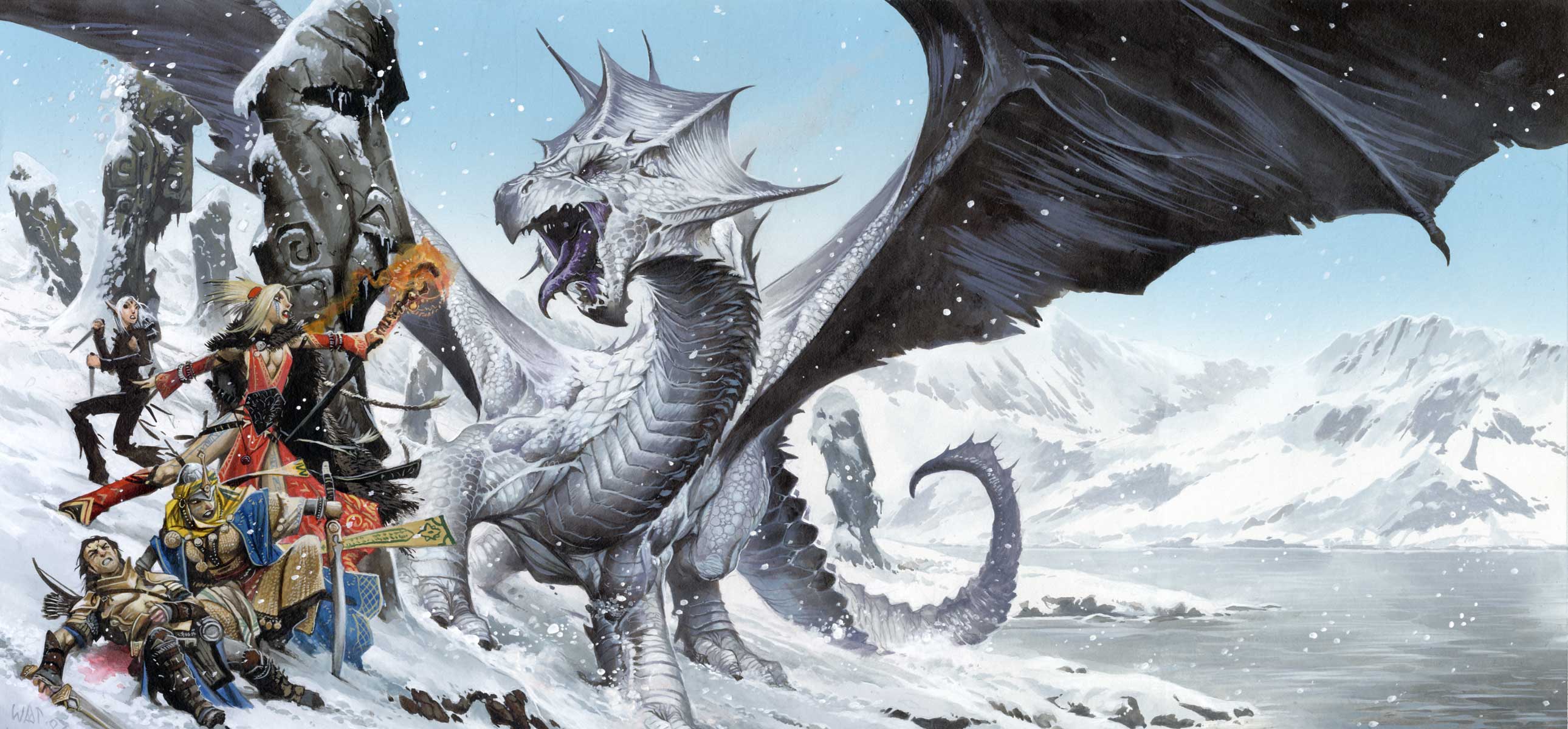
As such, it’s excusable when his anatomy seems a bit off, or the details seem a touch hazy around the edges. In his fantasy art, Mr. Reynolds appears less interested in capturing a world-that-never-was than in providing you, the viewer, with a visceral experience. Nothing exemplifies this better than his wall-of-action pieces. This is the stuff of childhood daydreams, where a hundred things are going on at once, gravity is a suggestion, and plausibility depends entirely on how much sugar you had in your breakfast cereal. This is what fans of D&D’s 3rd edition artwork mean when they say the new art is full of action and energy, where the art of older editions seems static, lifeless, and placid. Again, for these, Mr. Reynolds shifts his style, drawing on the techniques of comic book art. The silhouettes are iconic, the poses are full of action and momentum. We see not the moment of impact, but the follow-through afterwards that gives the impact its sense of energy. The weapons and armour are fantastical, without much thought given to such matters as how they could be crafted, or how they work. The focus is clearly on giving each figure a unique personality, expressed in that character’s choice of accouterments. Again, this stylistic choice reflects how we play D&D, with our focus on equipment as a way to empower and differentiate our characters from others of the same class and race.
I’m not one of those who thinks Mr. Reynolds can do no wrong. His cover for Green Ronin’s Black Company RPG is a mess, the sense of perspective so off that I can make myself feel a bit motion sick if I look at it too long. But I do get excited when I hear he’s got a new piece coming out. More than anything else, I find his art inspires me to think up new ideas for my gaming, whether it be unusual places to adventure, new foes to fight, or unusual challenges to overcome. Frankly, there’s no more important talent an RPG artist can have than that.


11 comments:
Very nice critique, Trollsmyth, and I also want to thank you for directing me to such nice pieces of art. Sadly, the 3.0 and 3.5 Player's Handbook art has soured my perception of Wayne Reynolds, simply because I can't stand any of the iconic characters from roughly pp. 25-57 of the 3.5 PHB. I'm not even sure which are his, but I find all of them dreadful, and most of the core 3.0/3.5 artwork almost as bad. AD&D art from the likes of Otus, Willingham, Parkinson, and Trampier has it all over dungeonpunk.
On the other hand, most of the artwork you have posted here is fantastic. In terms of sheer skill, they have me convinced that Reynolds is easily among the best D&D artists, ever. His flexibilty of styles is amazing. It's just too bad that someone at WOTC has apparently given him and other artists marching orders to create tattooed, spiky characters.
I think Reynolds is a bit like many extremely talented people -- he needs direction. Left to his own devices or given bad art direction, his stuff exemplifies everything I hate about modern D&D. But his Paizo work is among my favorite gaming art ever and it makes a nice counterpoint to sometimes overly "heroic" style of artists like Elmore and Easley (whom I both adore).
Seeing the variety of styles and approaches that Reynolds can take is, I think, good evidence that it's often not the artist that determines how well a piece turns out as much as his art director. The look of his WotC work is no more accidental than his Osprey work. And I think you're right that D&D artwork tells us a lot about how we, as gamers, perceive the game and what it's supposed to be about -- and further proof of why I feel alienated from modern D&D.
Brian,
WAR, as he abbreviates his name, doesn't have anything in the original 3.0 PHB. It was a bit before he really took off, so he didn't have a hand in any of the original iconics.
I don't have any of the 3.5 books, but WotC has a great resource for us art fanatics in their online galleries for each book. Looking at the iconics from the 3.5 PHB, he does have one: Gimble, who appears to be a gnome bard (http://www.wizards.com/dnd/images/ph35_gallery/PHB35_PG27_WEB.jpg)
I'm not crazy about it, but you can see how Mr. Reynolds enjoys playing with costume and details.
The giant of 3.0 artwork was supposed to be Todd Lockwood. He probably deserves a critique along the lines of one of those "Where Are They Now" sorts of things. Unfortunately, I fear he's one of the worst offenders in the early 3.0 artwork. :/
I'm also going to commit grognard heresy here and say I enjoy the work of John Foster. His Lidda is probably the most "iconic" of the iconics.
I have to agree with you on the art direction at WotC. It just boggles my mind, considering how great the art for Magic has been through the years.
- Brian
James,
I think I'd agree with you on his need for good direction, or, at the very least, his need to avoid bad direction. Easley certainly deserves a critique, but it would be interminably long, because of the shift of his style from his days doing black-and-white interior illustrations for modules, to his last great hurrah as the TSR cover artist on the 2nd versions of the 2nd edition core books.
I've mentioned before that WAR's art in 4th edition is clearly asking, "Who do you want to be?" That's sort of the idea behind iconics, I suppose. They're a smörgåsbord of cool that you get to pick from.
That of course, rubs us grognards the wrong way. We built our characters from the bare bones of archetypes and the stuff of dreams and naked breath. Assembling them from a catalog of parts, as if they were stereo system components, just feels dead to us.
That said, I do remember grousing that D&D was too limiting, and that it just didn't give you the options to really make the character you had in your imagination.
I guess there's just no pleasing some people. ;)
- Brian
I just know two kinds of artwork from Mr. Reynolds: the dynamic ones, featured in Magic the Gathering and Eberron-books inner covers; and the static, almost Tusseaud-like, ones featured in the Pathfinder books by Paizo. Even though I agree with some of the points of your critique, I just love his art representig such a variery and flavorful characters.
Great blog, by the way.
I almost forgot: Do you know where can I find all the characters featured in the Pathfinder Classes Chapter? I only saw the dwarven ranger link in your entry and I wonder if you know them all.
I don't know if all of them are there, but I got the pick from Paizo's blog. Unfortunately, it's not very well organized or searcheable, so you just have to page back, back, back to see when they posted a pic.
Trollsmyth,
I really enjoy your art critiques, though I haven't commented before. Even though I cut my teeth on D&D art in the beginning of the 80s, my art taste runs more to Parkinson, and even more to Lockwood (though not when he trends too much in the dungeonpunk direction.) So at first, WAR was too comicy/not realistic enough. Then I saw this: http://paizo.com/image/product/catalog/PZO/PZO9202_500.jpeg. (It's even more impressive if you get hold of the book.) Seeing he was capable of this really makes me hope that his Paizo art will trend away from his fourth edition art--both because this would brand Pathfinder in greater distinction vis-a-vis WotC, and for my own aesthetic joy.
I am very intrigued with your critique of Wayne Reynolds. I am an illustratour. Sadly, not as well known or as skilled as Mr. Reynolds, but my interests definitely lie in the "you are here" school. I grew up with the D&D of Larry Elmore and Parkinson. Michael Whelan was and is my absolute favourate illustratour. I do recognize Wayne Reynolds' style for what it is, and I must say that I enjoy his sense of design more than his sense of decor. I play the "you are here" types of games. They are usually gritty and realistic. Not bloody and disgusting, but there is a strong sense of realism. That's just how I like to game. That's how I like to make art, too. But design is another matter. You can tastefully embellish, as Maxfield Parrish did, without losing that sense of reality. Reynolds, even in his historical ventures, carries a more anime style that is hard to shake. He is, in every sense of the word, an illustratour. I think you are right that he changes his style to fit the scenes, etc. Elmore and Parkinson were part of a more idealistic age. Dragonlance, especially mixed the grit of Celto-Germanic and Grecian history with modern (I mean within the last 1000 years or so) cultural ideals. I find that my problem comes not with the composition or the rendering, but with WHAT it is he is depicting. I am not a heavy handed dogmatist or even a religious person at all. His illustrations cater to the WOW public, which, I must admit, is quite clever and fun, to an extent. But I think that Wayne Reynolds embodies a generation and that it is less considerate. Kill and smash mentality removes compassion from the social sphere. Not because people can't feel it. but because they are not being fed those things. A friend of mine was comparing our styles. he is also an illustratour. His images are action packed and usually portray the most dynamic elements of a scene. Mine, on the other hand, tend to be more contemplative. It is usually the calm right before the storm. The pause between moments, the consideration, the sense of repurcussion. I think both are fine, but I think that we don't see enough of the latter. That imagery makes the viewer slow down and consider: "What just happened?" The dynamics of right and wrong, to whatever extreme, can be considered and digested. It seemed like there were more contemplative pieces formerly in the D&D sphere, less high impact action. Character and story were stressed more than instant action and gratification. We are I think seeing a shift that Wayne Reynolds embodies. we have left the age of Right and entered the age of Might. Just as any epic story would suggest in their histories and even among our earth's histories, there are shifts, ebbs and flows. The tide of turning that cycles, brings back around. I will say that I think Mr. Reynolds' work is beautiful, his style established and professional, but I think it is a little irresponsible. D&D, in my opinion, has gone from story-based to stuff based. It can be argued that stuff was the thing in earlier games, as materials were still prized among party members' players. But, that stuff is now the thing that feeds the wanton lifestyle of WOW culture where consequences are largely overshadowed by eye-candy and promises of being the next baddest thing on the block. If Mr. Reynolds had shown up more toward the middle of D&D's true heyday, not this display of overstimulated self-indulgence, we would see something else. Or maybe he would have just ended up painting for Warhammer.
I loathe that stuff. I do not like stylized art, really in general, but if it's stylized I'll take LSD trip over that video-game looking crap.
If I had an RPG everything would be illustrated by Osprey artists. 100% accurate armor, including multiple-piece armor and not some goddamn ghost sheet KKK chain mail.
Hell, I will take garbage doodles Gygax did on a napkin over cartoon/anime/video game stylings. I don't like them in comic books. My favorite comic book illustrators are guys like Alex Ross, who give you a nearly photo-realistic Superman show realistically proportioned next to tiny mortals with normal physiques. That gives an impression of real power, and size, and the majesty (and the same would be true of a Tolkien elf - bug-eyed faeries can go to Hell, I want ubermensch).
Unknown: can you link me to examples of the stylized stuff? I assume you mean more than just the anime aesthetic that was so popular a few years ago.
Post a Comment