
If you go here, you can see the D&D 4th edition preview slideshow. You’ll get to see some of what I assume is 4th edition art. But before you watch, be sure to don eye protection. I swear, I have never before seen a collection of art with so many sharp, stabby, spikey, glowey, hurty things being jabbed RIGHT AT YOU!
I once said that Wayne Reynolds was on his way to becoming the Larry Elmore of 3rd edition. With the covers of 4th, it’s now official: Mr. Reynolds is the Jeff Easley of 4th. Already, I have to say, things look promising for 4th edition.
So far, I like it. I don’t *love* it. Ok, I think I may love the cover for the new DMG. But otherwise, it’s ok.
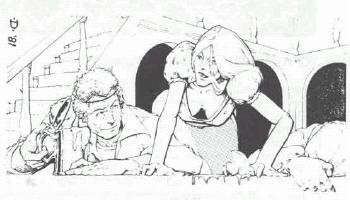
I wish I could get a closer look at some of those covers, especially the PHB. What I think I’m seeing on it is a strong, action movie freeze-frame, posed feel. Everyone is striking a cool pose, lightning is flying, but the attentions of the characters seems divided. The wizard is toasting something outside the frame, while the warrior babe is looking directly at you. There’s a lot of “directly at you” in this preview art. Almost all the portrait pieces had someone holding up a staff, a sword, or a mace towards you, as if to threaten you or show it off. A lot of people are going to look at these and say the look is all about action, but I think they’re really all about looking cool. There’s a strong differentiation between the characters, especially in Wayne Reynolds’ work. In the green dragon piece, the dragon is green, the warrior is blue and silver, the swashbuckler is red and brown, and the wizard is yellow. The dwarf’s palate melts into the orange of the walls, but he still stands out thanks to his crucifix-like pose and being a dwarf. The focus is clearly on the dragon, but everyone stands out here. Where Mr. Elmore’s work was “you are there,” Reynolds in 4th edition is “Who do you want to be?”
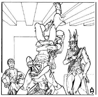
And William O’Connor is hitting all the “cool” buttons hard. The warrior here has strong Warhammer vibes with the oversized weapon and oversized pauldrons of overlapping plates and hanging tabs. But he’s got a spiky shield for a touch of 3rd edition. The thief, of course, is a tiefling, which is already fairly cool in most folks' books, but she’s got those crazy flaming daggers, and kick-butt heeled boots. The off-the-shoulder pauldron is a nice touch, both tying her visually to her warrior comrade and being flirtatiously sexy in an untypical way. Feminists will frown as they flip past it, but won’t immediately reach for a box of matches. ;)
And it’s very interesting what you don’t see. Everything is grim, cool people in the heat of action, or about to take action. You don’t see young men chatting up tavern wenches, or playful pranks. This is all about looking serious and looking cool.
The goal, clearly, is getting you, the viewer, excited, and to spur fantasies of the sorts of things your cool character will do while you play the game. The art is realistic enough for you to identify with it, but doesn’t impose any sort of realism on you. This is the “reality” of dreams, where gravity is optional and style is more important than practicality. With 4th edition’s emphasis on quicker play and PC options, it’s probably very fitting.


No comments:
Post a Comment