Cassini has sent us pictures of odd hexagonal shapes in the clouds over Saturn's north pole. This isn't a maybe-kinda-if-you-squint-funny thing like the face on Mars. These are serious, regular shapes, almost identical in the lengths of their sides and immediately obvious to the casual observer.
So what are they? A star gate? It's interesting to note that Saturn's moons may have icy surfaces, something interstellar travelers might find useful for a cosmic pit-stop. And, contrary to the way most games work things, because of the way dense objects bend space-time, it might actually be easier, not harder, to enter and exit hyperspace the closer you are to a large gravity well. With its flashy rings, making it easy to spot in a crowded solar system, Saturn might be the perfect place to stick such a gate.
Maybe the hexagons are the seal on a prison of a Great Old One. The planet has long been associated with primordial fertility deities. It's zodiacal properties are capricious and potent.
In any case, until NASA explains exactly what's going on up there, you can have all sorts of fun with this little fact in your sci-fi, weird history, or supernatural games. Enjoy!
Wednesday, March 28, 2007

 PDF
PDF

Avonia, ho!
Avonia is the name of a website and blog devoted to pen-and-paper RPGing, specifically of the d20 variety. The caretaker of Avonia, Patrick, also posts frequently at Treasure Tables, and it's from there I was pointed to this topic. Patrick's curious why we continue to play our old-fashioned, analog, pen-and-paper games when there are lots of fancy computer games out there just begging for our attention. He's got some ideas of his own, but he's curious to hear your thoughts. So why not pop on over and give him your two cents?
THIS IS SPARTA... in Second Life
Second Life has been much in the news this past year or so. Many pundits of the online gaming world, as well as financial and social observers, have felt spurred to chip in with comments pro and con. I’ve got a theory as to why Second Life, which after years of being almost free to play and still hasn’t garnered as many users as World of Warcraft racked up in the first six months, is a press darling. But that’s for another post, maybe…
Yes, I play in Second Life sometimes. Even there, I’m heavily in what you’d call the “casual gamer” group; even in my wild MUDding days, I was never a 30+ hours per week player. I doubt I’ve spent much time in the heady stratosphere of 20+ hours per week. I’m afraid I’m too easily distracted, especially by table-top-style gaming. This is why I don’t talk about online games that much. They fascinate me as intellectual exercise, they entertain me when I can’t get a better game going, but I’m not the rabid fan some folks are.
Ok, nice long-winded introduction there, Trollsmyth. What the heck does Second Life have to do with Bronze Age warriors? Well, there’s a territory in Second Life, referred to by the locals as a “sim”, devoted to the movie “300”. It’s a very cool little set-up as well. The sim is divided into five small islands. The central island is a large amphitheater which apparently was used for a roundtable discussion with Frank Miller and other notables from the film. One of the other islands, reached by a cute but rather silly little tram system, or by much more expedient flight, is a mock-up movie theater, where I assume clips were shown to the roundtable’s audience. I missed all that cool stuff, and the documentation I got implies it was by invitation only. I’m certainly no Second Life bigwig to get invited to an event like that.
Those are the least interesting parts of the territory, though. There’s a reading room that includes a big, in-game flip book with stills from the movie and production sketches. Kinda neat, especially since your Second Life self can take a copy to enjoy in the leisure of your virtual abode. Cooler than that, though, is the next island, which holds billboard sized side-by-side comparisons of the comic book and the movie. So you’ll see a tall board with a page from the comic where the oracle does her thing beside a still from the movie in wide-screen dimensions of the same scene. Frankly, either are works of art worthy of hanging on your wall. And since the images can both be had for free, you can hang them on your virtual wall.
What? Am I serious? Absolutely, true believers. I’m talking free textures. Granted, I’m not sure how often you’ll feel the need for a texture of Xerxes’ throne, or a phalanx of advancing Spartans. But they are available, and very cool.
But it gets better. The next island is a walk-through reproduction of
Not everything is available to be taken, but there are pots, helms, spears, bowls, cheese, and other goodies to give your Second Life dwelling a homey, if obviously a tad spartan, touch. Poke around for a bit, and you can also find an in-game gesture, so you too can kick people into wells while shouting the now famous line.
Liam Kanno (his SL handle), the builder of the village, is understandably proud of the work he did on it. He told me he’s not certain how much longer it will remain up. That’s entirely up to Warner Bros. I have no idea if the sim, called Silverscreen, is owned by Warner Bros. or is a private parcel that’s rented out for the promotion of movies. Regardless, it’s something I’m going to keep my eye on from now on. I can’t see them doing something like this for “Music and Lyrics”, but Harry Potter or one of Shyamalan’s flicks might be a perfect fit for a Second Life promotion.
Saturday, March 24, 2007
What the...
Ok, I've no idea why Blogger decided "SF Revival" needed to be in all giganto-text. The fix wasn't too hard: just go into edit mode and tell it what font and size I wanted. Still, I'm using one of their pre-made forms for a reason. Ah well, I shouldn't complain. It's a hell of a service for free.
The overwhelming response to my question about links was something like:
The overwhelming response to my question about links was something like:
Dude! Lighten up! You ain't the Blogfather. The only people who really pay any attention to your links are folks bored at work. Put what you want, and to hell with why.So I'm just going to leave them as they are for now. I might toss in a heading for games, and another for movies.
- Joe Trollsmyth-reader
Friday, March 23, 2007
The SF Revival
In this case, SF stands for “Star Frontiers”, TSR’s entry into science fiction RPGs. The game originally came out in 1982, and there was a review of it in the first issue of Dragon magazine I ever read. This was back when Dragon was more about the hobby of RPGs as a whole, with a sprinkling of war gaming and other fun stuff, and less a mouthpiece for a single company.
The game itself was pretty good, and a lot of fun. It had a surprisingly hard-science foundation. I remember thinking that using acceleration to replicate gravity and shielding your ships from lasers with a cloud of water vapor to diffuse the beam were clever ideas. The races were surprisingly alien as well. Yes, everything had a recognizable face, but the dralasites, sentient ameboides capable of producing a number of limbs dependent only on the character’s stats, didn’t have to. The yazarians were like a cross between a baboon and a flying squirrel, but they were the only other humanoid race. The villains were giant slugs with arms and paddles called slathar, and the remaining PC race were insectoid-like centaurs called vrusk. Compared to most other sci-fi games, then or now, having half of the PC races be non-humanoid really makes Star Frontiers stand apart from the competition.
The feel of the game was perfect for reproducing the space opera of the 50s, 60s, and 70s. The setting was a sparsely settled frontier, the worlds loosely united in a mutual defense league, but multi-stellar mega-corps often wielded more power than governments. Computers straddled the line between the number-crunching tools of the 70s and the wonder makers of the 80s. The robotic rules were a lot of fun, and while you couldn’t play a robot yourself, you were certain to interact with them, or possibly even build a few of your own. (If you’ve ever seen the movie “Ice Pirates”, you might have a good idea how the robot rules were often used in Star Frontiers.) Combat was notorious for dragging on, however, due to the low levels of damage done by the weapons. Still, if your idea of good SF reading included the works of H. Beam Piper, Robert, Heinlein, or the Commonwealth stories of Alan Dean Foster, Star Frontiers was a good fit for your science fiction RPG needs.
And apparently still is! Bill Logan (aka CleanCutRogue on RPG.net) has “digitally remastered” the game. He’s taken the same rules, unchanged from their release a quarter of a century ago, and reformatted them to match the look and layout of modern RPGs. You can find the impressive results here. His efforts have spawned a small community of Star Frontiers revivalists who will soon be putting out the third issue of their monthly web magazine, The Star Frontiersman. If this is a game you have fond memories for, or one you haven’t yet had the chance to enjoy, I’d recommend giving these new “editions” a look. Also, be sure to check out the thread that started it all, and is still going strong, at RPG.net.
Sunday, March 18, 2007
The shame. The shame!
Four months since my last update?!? Ok, that’s just inexcusable. Especially since so much has been going on. Things feel a bit quiet on the RPG front, admittedly, but there’s lots of new art stuff to talk about. Lea over at Paintpots has been working with sculpture, a medium that I feel fits her style very well. In Dragonlance movie news, there are new backgrounds. The first gave me a strong and worrisome Scooby Doo vibe, but the newest look to be very strong nods towards the brothers Hildebrandt. My feelings remain mixed, but hopeful.
But the big news for me is that I’ve finally gone through and begun to organize and update the massive mess of links I’ve been accumulating for this blog. You can see the fruits of this on the right-hand sidebar. If you know a link worthy of mention, please let me know. I’m still not entirely certain how I want to judge worthiness, honestly. You’ll notice I didn’t link to Parkinson or Elmore, or others in that league. Do I really need to? Doesn’t everyone already know them? Nene might arguably be in that league, I dunno. PvP and RPG.net certainly doesn’t need me to plug them, but I hit those almost every day, so they made the list. What do you think? Should I be linking the “big” names?
Thursday, November 30, 2006
A Multitude of the Heavenly Host
Just in time for your holiday shopping, Ruth Thompson releases her first book! The Book of Angels includes not just Ms. Thompson’s exceptional art, but also the art of L.A. Williams (whose "Stone Cold" has long been a Trollwife favorite) and Renae Taylor. The writing is supplied by Todd Jordan.
Catspaw Napping
From Storn over at RPG.net:
Y'all might have noticed that there haven't been any new Catspaw pages.
Unfortunately, Catspaw is going on hiatus. While I'm continuing to work on Chapter 3, we need to create a more complete website to host Catspaw. We want to have a more integrated site, possibly showing the pages a bit larger on the screen, maybe forums, blog for John C. Hocking to wax forth and of course, the inevitable merchandice.
We are looking towards launching at the beginning of the year. This will give us all time to spend with our families over the holidays and give me some time to get a few pages in the can. Each Catspaw page is really a time consuming endeavor.
So, watch this space for the website address, and thank you for being patient.
Sunday, November 19, 2006
At last, Part V!
I’m almost afraid to link to it, considering his hosting problems in the past, but Fredrik K.T. Andersson has finally updated the Pawn website with Part 5! Thrill as the pantless Ayanah and the clothing deficient demoness Baalah take on the three-headed, er, I mean “skulled”, monstrous undead spidery thingus. Do I really have to tell you it’s not safe for work? Click here to find out how our heroines escape nearly certain icky and unpleasant death.
As an added bonus, there’s a link to Mr. Andersson’s gallery on the web page of David R. Dorrycott. Again, it’s NSFW. It includes older work by Mr. Andersson, including a few pieces that have vanished from his Elfwood gallery.
Sunday, November 12, 2006
Online Meets Offline
Now this could be very interesting. For those of you who don't know, Eve is a sci-fi game of economic politics that breaks all the rules. In spite of everything "known" by the conventional wisdom, it promotes player conflicts as the primary source of fun, and has been quite succesful.
And White Wolf was, of course, the architects of the great Second Wave of gaming in the 90's with "Vampire: the Masquerade". Their "Exalted" is a current darling over at RPGnet. This is a development that bears watching...
And White Wolf was, of course, the architects of the great Second Wave of gaming in the 90's with "Vampire: the Masquerade". Their "Exalted" is a current darling over at RPGnet. This is a development that bears watching...
Because Not Everything Needs to be About Art
While checking out the search path of a recent visitor (Hello,
So I guess everything is about art.
Well, in that case, I might as well mention that you can get your fill of NSFW fantasy art by checking out the recent updates to Fredrik K.T. Andersson’s Elfwood page (new stuff outlined in red) and all three of Håkan Ackegård’s galleries: Fantasy, Playelf, and Grigbertz. Be sure especially to check out the latest update to his fantasy gallery. It’s a real shocker: a completely safe for work drawing, in color, of a guy!!!
Friday, November 10, 2006
A Critique of Larry Elmore’s Art
Continuing with my thoughts on gaming art, especially art associated with the various incarnations of D&D, I’ve jotted down some of what I think of Larry Elmore. Recent back-and-forth over at RPGnet implies that Mr. Elmore is something of a divisive figure. People either adore his work or abhor it. All agree, however, that it is very closely associated with D&D and fantasy gaming in general for a specific period of time.
About Elmore’s work. I like it. But I think if you didn’t come to it at the right time, it may rub you the wrong way, because it’s very dated in its style.
Today’s fantasy art, especially in D&D, is very superheroic. The guys have rippling, sometimes bulging muscles, extremely broad shoulders, chiseled features. The ladies are all slim, almost ethereal. Weapons are oversized, shields and armour are highly ornamental, and the action is over-the-top to match that look. Even the great Lockwood isn’t immune; check out his pencil-sketch races on pp 12-14 of 3.0’s PHB. The men sport overly long arms that reach almost to the knee. The women are all lithe and cut, with the bodies of gymnast. There’s not an hourglass figure to be seen on any of them.
Elmore’s art usually isn’t like that. He came into gaming art early in the 1st edition AD&D years. The look was still defined by the rough and scruffy art of Otus, Trampier, Pekul, and Southerland. Even comic-styled artists like Willingham and Dee “reigned it in” by modern standards, giving us characters with more human proportions and less fantastical equipment. There seemed almost a tendency towards realism, whether it was Holloway’s armour and weapons, or Trampier’s spent-last-night-sleeping-in-a-ditch hair styles.
Elmore brought to this trend an exacting knowledge of anatomy. You never look at an Elmore piece, even in his most humorous work, and think, “arm’s don’t move that way.” Whether a figure was standing, kneeling, sitting, sprawling, running or leaping, the movement looked natural and the body looked real. Clothing hung naturally from the body’s frame, flowed in realistic breezes, or swung under the body’s motions. Weapons and armour may have been fantastic, by they also looked like they worked. Shields would deflect blows, not catch them. Swords clearly would slide easily in and out of scabbards or enemy bodies without getting hooked on bones, or shattering due to bizarre metallurgies.
We’d seen similar before, from Frazetta (though I’d almost say that Frazetta’s muscular men and voluptuous women are more akin in their superheroism to today’s dungeonpunk style in many ways). But where Frazetta’s backgrounds were vague, obscured by smoke and mist, Elmore brought the same exacting detail that he applied to the human body into his backgrounds. We saw the intricate detail of bark upon the tree, autumn leaves curled and caught among the grass, the dusting of snow upon the mountainside, wisps of cloud scudding across blue skies. His environments were rich in such details, and he wasn’t afraid of distance or depth. Giants thundered in the middle distance, castles perched upon distant mountain peaks, and even further out and up, dragons soared far, far above.
The total effect, which extended to beasts both mundane and mythological, gave his art a sense of verisimilitude. They felt less like expressions of boundless imagination and more like portraits of a world just next door. These were images of our world, as it might have been, maybe even as it should have been. The restraints of gravity and physics, weather and sunlight, anchored his amazing people and creatures in a reality that felt solid and three-dimensional.
I think the zenith of this style is found in the late Parkinson’s “Druid Stone.” You can taste the crispness of the autumn air, feel the cool solidity of the granite rocks. The girl’s body is both voluptuous and in the grip of gravity; no balloon breasts here, but honest flesh, soft and warm. Her posture and attitude are so relaxed, it doesn’t feel like a pose, but like a memory. This isn’t so much a portrait as it is a snapshot, a moment of time captured on the canvas. You want to say you’ve known her, heard her grinch about what a mess her hair is, eliciting chuckles from the scaley friend at her side. I love the way the lizard’s forelegs are locked, pushing up and back into the girl’s nails as she scratches the back of its head. This is what we were aiming for in our gaming, back then: a sense of being there, of walking through elven woods, or wyrm-infested caverns. It wasn’t about the wild wire-fu acrobatics of action movies, or the brilliant lens-flares of computer animation. It was about the crunch of dried leaves beneath your boots, the weight of mail across your shoulders, the smell of leather and horse in your nostrils, and the thrill of wondering what was beyond those hills, or past that turn in the trail.
One thing that made Elmore great, however, was that while his art felt wonderfully real, it wasn’t quite photographic. Some artists of the time painted too much what they knew and not enough of what they dreamed. You ended up with characters who looked less like adventurers and more like Bob and Cindy from accounting, dressed in funny costumes. Elmore struck a balance, and you can see it in the faces of his characters, especially the women. Cool, almost cold, with lips just shy of pouting, doe-eyed beauties gaze out of his paintings and sketches. To a teenage boy in the 80’s, these were not the girls we knew, but the women we dreamed of deserving some day. There was confrontation in their eyes, hesitation in their postures, the sense that, if you didn’t do or say just the right thing in the next moment, blades would be drawn, ensorcelments would be cast, and a chance would be forever lost.
And there was the hair. Oh, gods, that 80’s hair! Not the mussed, sleeping outdoors look, or even the finger-combed, practical ponytail of Parkinson’s druidess. This was the full on, big hair of the 80’s. Poofed, curled, styled, descending in thick waves, cascading in bouncing curls, escaping loose and heavy braids. To my eyes, the eyes of a man who came of age watching Cybill Shepherd in “Moonlighting”, Stephanie Zimbalist in “Remington Steele”, and Madonna, who changed her hair every other week to something new and shocking, the hair of Elmore’s women is simply a dash of fantasy, a playful touch that gives his ironclad realism a magical flourish. Instead of the jarring image of the girl next door brandishing a cleaving blade of war, you know you’re looking at the princess of a fantasy realm, with just enough of the common touch to make her possibly approachable, but never taken for granted. I can only imagine, however, to sensibilities not forged in the decade of “Miami Vice” and “Dynasty”, that this hair must look, at best, mildly anachronistic. To today’s teenagers, obsessed with regimentally straight and “natural” hairstyles, Elmore’s choices must seem laughably baroque.
That sense of almost real applied the costumes he created as well. Worn and used, clearly, but also clearly in the style of traditional fantasy tropes. The billowing cloak was kept in proportion to the body. The wizard’s robes, while trimmed with arcane sigils, was short enough to not impede walking. Boots were sensible, and it was rare to see anyone in high heels, or sporting bizarre projections or hooks upon their armour. His outfits were almost always sensible, and looked to be the sort of thing people would actually adventure in. Yes, he did have a few babes in chainmail bikinis, but he hardly deserves to be singled out for that. Metal bikinis were more the
For me, Elmore’s vision of fantasy armour became my expectations: separate pieces, sometimes mismatched, strapped to the body for protection but as slimmed down as possible. The profile was human, not fantastic, and there was little to hinder the nimble adventurer, whether wading away from a sinking ship or squeezing through a tight crevice in a deep cavern. Protection balanced against encumbrance, with style lagging far behind both as a concern. But a bit of “costume” armour was fun too, every now and then.
In terms of realism versus superheroism, the period dominated by Elmore and Parkinson is something of an anomaly. Before them, we have the superheroisms of Vallejo and Frazetta, earthy and muscular, passionate and wild. They painted with a certain realistic veneer atop a Dionysian poetry. Today, it’s the superheroism of comics and action movies, frozen in snapshots, baroque in its costumes, and vertigo-inducing in its composition. But because Elmore was central to the look and feel of gaming for nearly a decade over a broad range of material, his influence on the genre has been profound. From “Star Frontiers” to the covers of the Dragonlance novels, an entire generation of gamers grew up with his images shaping their assumptions about the fantastic.
UPDATE (Jan 27, 2008): Mr. Elmore has reorganized his web page, and all my links to his art were broken. They're fixed now, but some of the art I originally linked to is gone. I've done my best to replace them with other options that still represent my point. In any event, you shouldn't take my word for anything I say here. Browse his site, find something you like, and buy a work of your own from this master of the genre. You know there's more than one thing over there you've always wanted to hang on your wall.Sunday, October 29, 2006
The Changing Aesthetics of D&D
Seems I’ve been thinking a lot recently about art and RPGs. Lately, the two have merged in a discussion over at RPG.net on the surprising renewed interest in 1st edition AD&D. Among the differences between 1st and 3rd edition that have been discussed is the aesthetic themes both games embrace. If you flip through the rule books, it’s clear to see each game has a very different vibe to it, and it goes beyond simply black-and-white versus color. Where the heroes depicted in the new books are young, well-coifed, and heroic, 1st editions art shows grubby and greedy mercenaries, often engaged in combat, and sometimes even bearing the grime and scars one would expect on dungeon adventurers. There’s a moral ambivalence as well. It’s easy to tell villain from hero in 3rd edition’s art. The bad guys, always NPCs, are dark, often deformed, sneering and hunched, while the heroes are tall, leaping into the action, usually brightly colored and with unblemished features.
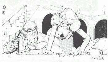
1st edition art isn’t quite so clear. A classic example is Trampier’s “Emirikol the Chaotic”, found on page 193 of the 1st edition Dungeon Master’s Guide. (You can find a small scan of it here.) A bearded mage gallops up a narrow street on horseback, cloak flying in the wind. We assume that he’s Emirikol. He’s twisted back to cast a spell at a crossbowman behind him. A town guard? Perhaps, as another fellow in similar equipment lunges from the door of the Green Griffon, drawing his sword to intercept the marauding wizard. Another bearded man scowls at the scene from the safety of the Green Griffon’s doorway while some poor fellow smolders in the foreground, possibly another victim of Emirikol’s magic. Frightened citizens flee in the scene.
So what’s going on here? Why is Emirikol involved in a running battle with warriors? Are they the town guard, attempting to prevent a crime or catch a criminal? Or are they the criminals attempting to assassinate Emirikol? Who are the heroes? Who are the villains? Are there any heroes, or is everyone a villain? There are no clear answers. We’re left with only a scene of action, devoid of any moral context. Heck, we don’t even know that the bearded rider is, in fact, Emirikol.
What follows is largely from posts I’ve made over at RPG.net. I’ve tried to touch on what I see as the major differences in tone achieved by the art of both the 1st and 3rd editions of D&D, focusing primarily on the core rulebooks of the Player’s Handbook and Dungeon Master’s Guide. I’ve also made some wild guesses as to the reasons for those differences.
I think a lot of the change in aesthetics can be explained as a collision between the corporate goals of TSR circa 2nd edition and general trends in fantasy literature. On the TSR side of things, there was clearly a move away from the moral ambivalence of 1st edition. 2nd edition not only assumed the PCs would be good-guy heroes, they actively weakened the villains (there’s nothing more pathetic than a 2nd edition necromancer played out of the PHB) and watered down the powers of evil. It’s clear from the early days of 2nd edition that TSR wished the demons and devils of 1st edition would just go away, like the assassin did. Pushing the idea of good heroes always triumphing over evil was an attempt to insulate the company against the “angry mother” syndrome. In the end, the growing cultural irrelevance of RPGs would combine with this strategy to insulate TSR not only from angry mothers, but also consumers, who would be tempted away by the dark anti-heroes of White Wolf’s “World of Darkness”.
Fantasy literature at the time of 1st edition’s publication was a dark genre. In spite of the central place held by Tolkien and Lewis, fantasy was dominated by pulp heroes migrating from the magazines into paperback collections. These heroes included Conan, Elric, and Fafhrd and the Grey Mouser (cited frequently by Gygax as a personal inspiration). These heroes are violent and bawdy, eldritch and intimidating, and usually dirty and in danger. The art of 1st edition reflects this. 1st edition taverns are full of buxom tavern wenches chatting up celebrating adventurers (usually male), while heavy armour, often historically accurate or bulky, is common, and nudity and acts of violence abound.
By the time 3rd edition was released, fantasy had changed. A lot. While much of the “old guard”, like Conan and Elric, were still respected, others had been all but forgotten, like Leiber’s heroes of Lankhmar and Wagner’s Kane. Some were openly reviled, such asNorman
Again, the art reflects this. 3rd edition art lacks the scruffy-looking vagabonds of 1st edition art, replaced by the “beautiful people” of TV and movies. Gone also are the casual cruelty and most of the bawdiness. (It is telling, I think, that while the art of “The Book of Vile Darkness” is wallowing in viciousness and pain, the nudity is barely on par with the 1st edition DMG.) The heroes are either bright and cheerful, or grim and determined. Where the unnamed thieves of 1st edition gloated over their uncovered treasure hordes, the glint of avarice clear in their eyes and blood sometimes still fresh upon their blades, 3rd edition’s perky Halfling babe grins happily at the single, though rather large, coin in her hand, glowing with satisfaction at having overcome the chest’s fiendish traps.
Fantasy literature at the time of 1st edition’s publication was a dark genre. In spite of the central place held by Tolkien and Lewis, fantasy was dominated by pulp heroes migrating from the magazines into paperback collections. These heroes included Conan, Elric, and Fafhrd and the Grey Mouser (cited frequently by Gygax as a personal inspiration). These heroes are violent and bawdy, eldritch and intimidating, and usually dirty and in danger. The art of 1st edition reflects this. 1st edition taverns are full of buxom tavern wenches chatting up celebrating adventurers (usually male), while heavy armour, often historically accurate or bulky, is common, and nudity and acts of violence abound.
By the time 3rd edition was released, fantasy had changed. A lot. While much of the “old guard”, like Conan and Elric, were still respected, others had been all but forgotten, like Leiber’s heroes of Lankhmar and Wagner’s Kane. Some were openly reviled, such as
Again, the art reflects this. 3rd edition art lacks the scruffy-looking vagabonds of 1st edition art, replaced by the “beautiful people” of TV and movies. Gone also are the casual cruelty and most of the bawdiness. (It is telling, I think, that while the art of “The Book of Vile Darkness” is wallowing in viciousness and pain, the nudity is barely on par with the 1st edition DMG.) The heroes are either bright and cheerful, or grim and determined. Where the unnamed thieves of 1st edition gloated over their uncovered treasure hordes, the glint of avarice clear in their eyes and blood sometimes still fresh upon their blades, 3rd edition’s perky Halfling babe grins happily at the single, though rather large, coin in her hand, glowing with satisfaction at having overcome the chest’s fiendish traps.
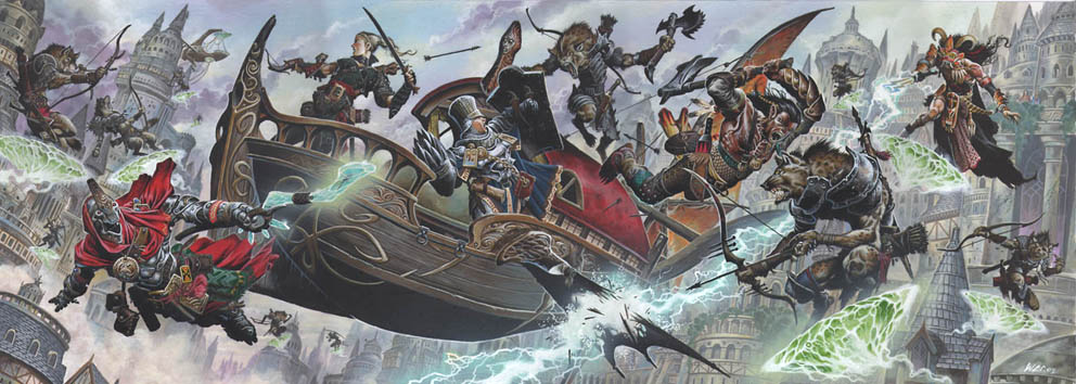
The action’s taken a more cinematic and extreme style as well. Where in 1st edition, you could show a heroic group spread out around a dragon, bows drawn and swords swinging, 3rd edition’s adventurers cling to a shattered bridge, threatened as much by the precipitous abyss that yawns beneath them as the raging dragon above. And there’s nary a drop of blood to be seen.
Yes, anime and comics have had their influence, but not so much as movies and TV, I think. The unscarred and youthful heroes owe more to “90210”, I think, than they do to “Record of Lodoss War”. The “wall of action” style that graces the Eberron books, as well as the funky “lens” effects, like flare and fisheye, are also an appeal to the cinematic imaginations of today’s fan of action movies and console gaming.
Is it any wonder, then, that the grognards recoil in distaste? They’re still reliving their Thieves World dreams of trodding the jeweled thrones of gritty and brutal worlds beneath their leather sandals. They wish to carve their own paths in their dreamworlds with sword and spell, blood and grit. They rage against the powers that be by plundering temples and evading town guards. They don’t want to rescue orphans, support good king Lomipop, or build hovels for the homeless. They certainly don’t want to be the town guards, who they know are all either inept and bumbling, or corrupt and cruel. At least, that’s the way it used to be…
Where 3rd edition has improved on 1st by clearing away the bizarre game-isms that never made sense and giving fighters a reason to keep adventuring past 10th level, it’s also maintained 2nd edition’s goody-two-shoes pretensions. The rough-and-tumble brawling feel of yesteryear has been replaced by the accounting and bookkeeping of feats and prestige classes. Granted, those feats and prestige classes solve some longstanding issues with AD&D’s mechanics. But they also change the feel of the game, and how it’s played. They’ve increased its complexity, and made it harder for by-the-seat-of-your pants DMs to weave adventures from a few jotted notes and the odd, stray daydream. Truth is, 1st edition AD&D is a very different game from 3rd edition, so it’s no wonder that people hold strong opinions on their preferences, especially when we keep being told it’s the same game, only “improved”.
Yes, anime and comics have had their influence, but not so much as movies and TV, I think. The unscarred and youthful heroes owe more to “90210”, I think, than they do to “Record of Lodoss War”. The “wall of action” style that graces the Eberron books, as well as the funky “lens” effects, like flare and fisheye, are also an appeal to the cinematic imaginations of today’s fan of action movies and console gaming.
Is it any wonder, then, that the grognards recoil in distaste? They’re still reliving their Thieves World dreams of trodding the jeweled thrones of gritty and brutal worlds beneath their leather sandals. They wish to carve their own paths in their dreamworlds with sword and spell, blood and grit. They rage against the powers that be by plundering temples and evading town guards. They don’t want to rescue orphans, support good king Lomipop, or build hovels for the homeless. They certainly don’t want to be the town guards, who they know are all either inept and bumbling, or corrupt and cruel. At least, that’s the way it used to be…
Where 3rd edition has improved on 1st by clearing away the bizarre game-isms that never made sense and giving fighters a reason to keep adventuring past 10th level, it’s also maintained 2nd edition’s goody-two-shoes pretensions. The rough-and-tumble brawling feel of yesteryear has been replaced by the accounting and bookkeeping of feats and prestige classes. Granted, those feats and prestige classes solve some longstanding issues with AD&D’s mechanics. But they also change the feel of the game, and how it’s played. They’ve increased its complexity, and made it harder for by-the-seat-of-your pants DMs to weave adventures from a few jotted notes and the odd, stray daydream. Truth is, 1st edition AD&D is a very different game from 3rd edition, so it’s no wonder that people hold strong opinions on their preferences, especially when we keep being told it’s the same game, only “improved”.
UPDATE: I've tracked down some of the 3rd edition art I reference in this piece. When I first wrote it, it was easy to assume that just about everyone reading it was familiar with the art in the 3rd edition core books. Now that 4th edition is six weeks from release, I just can't make that assumption anymore.
Also, some have suggested that I hate 3rd edition's art. Far from it! I'm not crazy about the dungeonpunk look, and in general I prefer Elmore and Parkinson, but I'm also a big fan of Wayne Reynolds, Arnie Swekel and Todd Lockwood. This article isn't how one style is better than the other, but how they are undoubtedly different in themes, tone, and impact.
I've also cleaned up the writing a bit. Articles, stories, and posts are never finished, just abandoned. ;)
Friday, October 27, 2006
Monday, October 23, 2006
Welcome to Paintpots
There’s a new artist blog on the block, Lea Sheler’s “Paintpots”. Ms. Sheler plans to post tidbits from her sketchbooks as well as other art projects. In addition to the title page of her latest sketchbook, she’s included photos of a paint job she did on her walls. Lovely stuff! The colors and style strongly remind me of a tiny nook in the church where my wife and I were married. The choice of a sharp, gothic peak is an interesting one. Typically, the gothic arch is very cool, apollonian, and humbling. Its use in churches and cathedrals draws the eye and thoughts upward, and the severe verticals shrink the viewer, dropping you into the bottom of a pit.
Ms. Sheler, however, has combined them not only with warm, earthy tones, but capped them with delicate, subdued floral motifs. She’s avoided the towering verticals that usually support these arches. She has, in fact, sunk the shape into the earth, and gently feminized it. The room is warm and inviting. It both frames and hugs the dark furniture. And it’s not like any other room in her city, I’ll bet. There’s a lot to be said for something that is both unique and of you.
While the colors say “southwest” the shapes say “Gondolin” to me. No shock there, as Tolkien themes seem to dominate at her Deviant Art gallery. Her work strongly reminds me of the better children’s books I had when I was a kid. Well, ok, I say “better”, but I mean the ones I enjoyed looking through probably the longest, and set aside later than most. Again, a strong sense of earthiness combined with weight and a scratchiness of pen and pencil digging into the paper, almost as if she were more carving then drawing. The images seem to grow up from firm foundations at the bottom of the page. Her characters seem scarred, tested by fire. Maybe it’s just being late October, but I get a strong vibe that speaks of rabbits and toads, oats and apples, dried herbs and corn goddesses hanging from the rafters, and ancient wyrms curled around granite boulders, sipping from a shaded stream beneath hoary oaks. A touch of Brian Froud, maybe?
She’s clearly still testing out her own styles and strengths, but has a strong foundation to build from. I’m not artist, but I’d look to varying the weight of her lines more, with bolder, heavier outlines. Be sure to check out her calligraphy, which is also very strong, especially in the map of Middle Earth. Strong nods to Tolkien’s own penmanship, but with a soft, inviting grandeur that is clearly her own.
The real mystery for me, however, is why she linked to this blog. No, I’m not just fishing for compliments. ;) I am very curious why people who are not looking for a review of Ptolus read this page.
And it makes me look at my paltry list of links. Tsk, tsk. I never finished putting up my original list, and it keeps growing. Back to the forge for this troll…
Thursday, October 19, 2006
Art Update
Lots of recent art activity to talk about.
First, there’s new black-and-white concept art over at the official Dragonlance movie page, including Laurana, Pyros (in human form), a goblin, and Riverwind. Nothing earth-shattering here; I’m still getting an old-school Saturday-morning cartoon vibe from this art. It is interesting to note that Riverwind is looking distinctly not very American Indian. After Ms. Lawless’ report of her experiences doing voice work for the movie, I would not have been surprised to see something a bit more Cherokee.
Pawn is still down, but there’s some new art in Mr. Andersson’s Elfwood gallery. It’s what we’ve come to expect from his work: a few tough-looking babes, interracial romance, a surprised father, and fairy abuse. Just what does Mr. Andersson have against fairies, anyway? As usual, his art is not safe for work, though these additions are safer than most.
And speaking of Pawn, Outsider is on hiatus while Arioch concentrates on some freelance work, proving my point from earlier about the costs of free comics.
While he doesn’t have new art, Hakan Ackegard has given his pages a spiffy new look. I enjoy the random image feature. And looking around, I notice that I haven’t reviewed the not-safe-for-work Underdark sketches at his Grigbertz page. Hopefully, I’ll be able to post some comments this weekend.
Monday, October 09, 2006
Trollwife Brings the Funny
Trollwife has just added a pair of new posters to RPG.net's motivational poster thread. (Scroll down past the hooker. ;) )
Hmmm... Is it just me, or is Max Zorin clearly thinking, "Damn! Should'a used more cowbell."?
Hmmm... Is it just me, or is Max Zorin clearly thinking, "Damn! Should'a used more cowbell."?
Hit Locations for True20
Interesting thread on adding hit locations to True20 over at RPG.net. Normally, I’d be again’ it. The extra book keeping that would require seems antithetical to the spirit of True20. However, the abstract damage system doesn’t quite mesh with the “playing a novel” feel of the game, especially in its Blue Rose incarnation. I’m going to be keeping my eye on this one, to see if something inspired shakes out.
Sunday, October 08, 2006
Payin’ the Bills with Your D&D Skills
Yeah, this looks like it’s for real:
“So my friends and I, successful professionals, were considering hiring a GM full time but we don't know much much to pay such a person.” – Ian Noble
Don’t laugh. The idea’s not as crazy as it might look at first. When you consider how many people want a good RPG experience versus how many people actually seem to be having them, you can easily see how good GMing is, in fact, a scarce resource. I certainly didn’t have to search long or hard to find a thread like this. Economics teaches us that scarcity creates demand, and markets generally form to satisfy those demands. I’ve certainly gotten far more, and better entertainment, from an afternoon playing RPGs than I usually expect from a movie or TV show. Even bad gaming is consistently better than most TV.
This does, however, bring up all sorts of questions about the dynamics of gaming. How much of a good game comes from the players, and how much is the responsibility of the GM? If the players are paying the GM, that implies the onus of fun lies squarely on the GM’s shoulders. A paid GM will have to provide quality entertainment to keep the players, and the cash, coming. But if the players are unwilling to do a minimum of homework themselves, such as keeping up with notes in the game, maintaining their character sheets, or even learning the rules of the game, there’s nothing even the best GM can do to entertain them. It’s a bit more like having a personal trainer than a paid entertainer. A lot of what you get out comes from what you put in.
And I don’t think money like this would ruin the game. Most of the world’s greatest art was done for pay. Bach composed most of his organ pieces while he was employed as a church organist. Shakespeare was a professional playwright who fully expected to reap a percentage of the Globe’s box office. Michelangelo not only got paid to paint the ceiling of the Sistine chapel, but was practically forced to do so at sword’s point.
If you believe that “true art” springs only from the unsullied inspiration of unfettered artists, then art isn’t what you think it is. Cash and sex have been the root inspirations of almost everything now considered a classic.
Wednesday, October 04, 2006
Comics for the Comics God!
I haven’t played a game of Warhammer 40,000 in over a decade, but I still turn occasionally to the websites and magazines for inspiration and entertainment. I enjoy flipping through my old rulebooks and looking at the art, and hold dear my meager collection of novels by Ian Watson.
So I hope you’ll excuse me for not noticing this sooner: an original color comic series based upon the WH40k universe. The artwork owes a lot to the current cartoon fashion, with an emphasis on verticles and simplicity in design. Many of the elements feel almost icon-ish. And yet, it’s usually very easy to tell the different characters apart and there is a strong sense of heft and depth in every panel.
The first story, about a squad of Sisters of Battle, is a little simple, but does a decent job of introducing you to the styles of the artists, as well as their take on the 40k universe. After that begins a longer story promising more depth. I’m curious about some of their plotting choices (I would have told the sergeant’s story in a series of flashbacks, rather than all at once, in order to move more quickly into the story). And, unfortunately, there doesn’t appear to have been an update since June. Still, it certainly appears to be worth keeping an eye on.
Subscribe to:
Posts (Atom)


 Posts
Posts